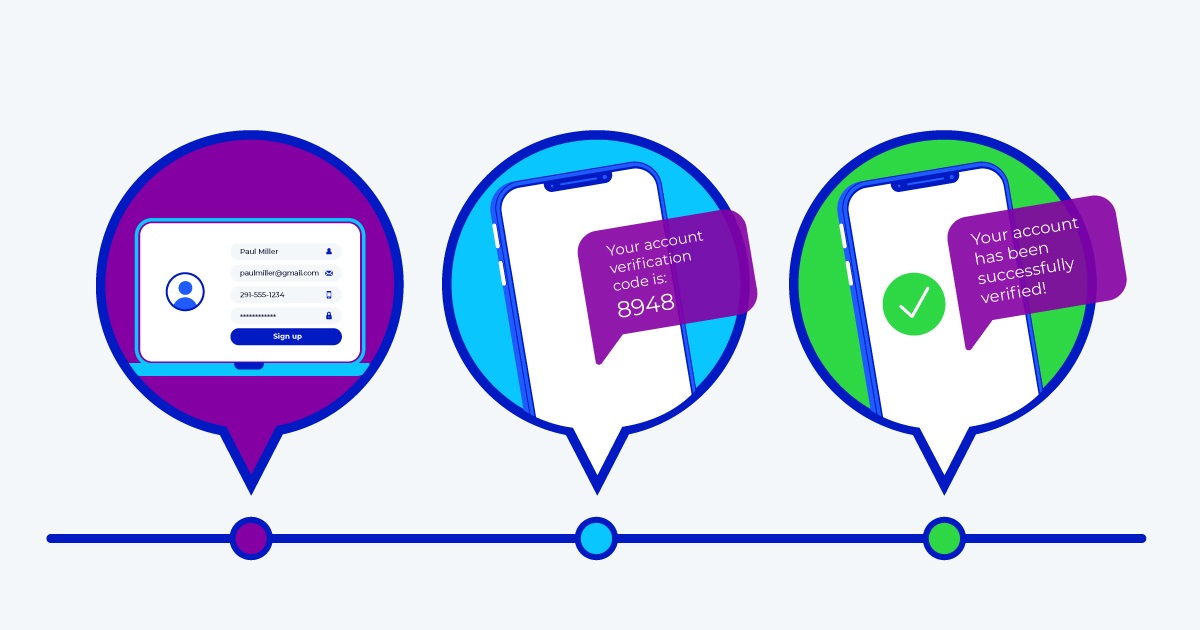
Congratulations! You’ve made the decision to protect your brand and your web and mobile app account users from fraud through phone verification. This is a vital account security step that not only helps reduce fake users and registration fraud but also provides a method for preventing account takeover with two-factor authentication (2FA).
But because this value isn’t always obvious to end-users, it’s important to make sure they fully understand you’re presenting phone verification as a security option-one that benefits them the most.
To help ensure the best overall user experience that promotes general security awareness and increases end-user adoption and conversion-we’ve compiled a list of the top ten best practices to incorporate into your user interface (UI) when implementing phone verification at new account registration.
1. Explain why their phone number is required
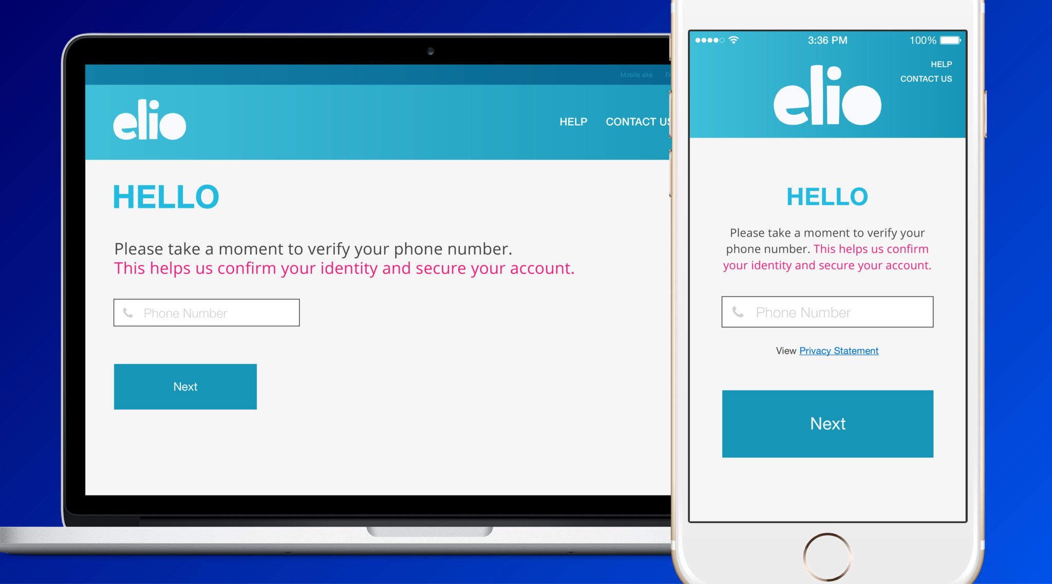
We all like to know why we have to do something and it makes us feel better to know there is a good reason. You should clearly explain that the customer’s number is required in order to verify their identity and securely complete their registration.
The terminology will depend on the use-case, but one example is: “Please take a moment to verify your phone number. This helps us confirm your identity and secure your account.” You can do this within the registration experience or, depending on device (mobile or desktop), offer a further information link/pop up option, which could also include a privacy statement explaining that SMS messages or voice calls may be directed to the number for verifications.
2. Let them choose how to receive the verification code
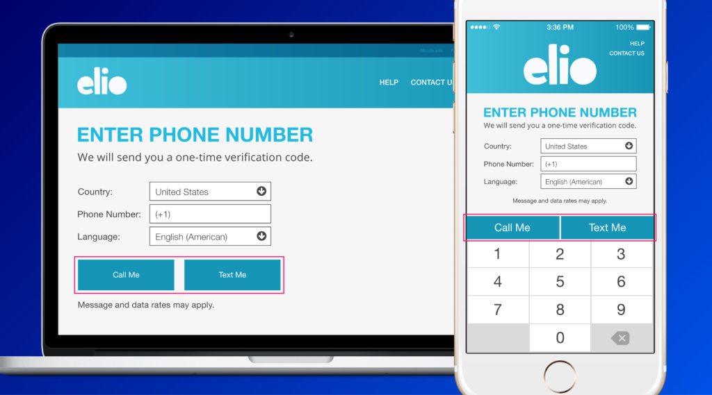
Offer end-users the ability to choose how they would like to receive the verification code, either via SMS – a good as any reason to include SMS opt-in – or voice. Reasons for this include:
- Personal communication preference
- Certain users do not have unlimited SMS message plans and are charged per SMS message received
- In certain countries, SMS may not be as reliable as voice due to older infrastructure, political unrest, etc.
- Certain demographics may prefer not to use SMS
3. Explain next steps

It’s best to describe what the end-user can expect at each step of verification. For example, on the screen where the end-user confirms sending the verification code, it is recommended that you add text such as “We will send you a one-time verification code.”
4. Do not use the term “pin code”
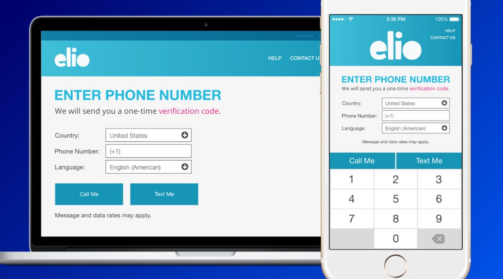
When describing the one-time-passcode (OTP) step of the process, use “verification code” or “one-time verification code” instead of “PIN code” to emphasize the purpose. Verification code implies an OTP that is limited to the instance whereas PIN is often a recurring identification code such as for a bank ATM card.
5. Add disclaimer language

Include a statement like “message and data rates may apply” so the end-user is aware of all potential costs with phone verification.
6. Assist with number formatting

When requesting a user’s phone number, separate the country code from the phone number field. This reduces the chance of an end-user entering an improperly formatted phone number (for example, entering the country code twice). We suggest displaying the country in one of two ways:
- Display the country name with the country code for the end-user to select from a drop down
- Auto-populate the country code based on the country name selected
Telesign’s phone number cleansing system, which auto-corrects improperly formatted phone numbers, is applied to every transaction to ensure the highest deliverability possible. However, Telesign still recommends the noted formatting to encourage the end-user to enter their phone number correctly.
7. Offer language preference

Allow the end-user to choose which language they would like to receive the message in. An end-user’s country does not always correlate to a specific language as they could have a general non-native preference.
8. Offer support

In response to a user improperly entering a number, first re-prompt to enter a “valid” number. This also applies if they are using a number identified as risky, or providing a land line that cannot receive an SMS message.
Also limit the number of times an end-user can request a verification code and/or offer manual support such as contact information for customer support or link to a ‘Help’ page.
9. Offer a backup messaging method
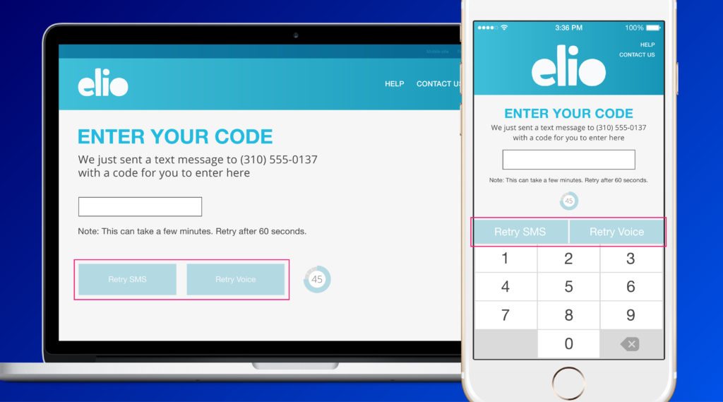
As a backup to the default option, also give the end-user the option to retry sending the verification code through another method (after a specified amount of time, such as 45 seconds). For example, if you are only offering SMS, provide the end-user the option to resend the verification code by voice.
10. Once verified, complete account creation
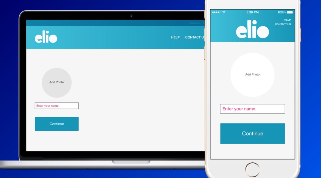
Following the recommendations above should lead to an end-user successfully receiving and then correctly re-entering their verification code into your web or mobile registration flow.
Once confirmed, the end-user can complete their account by entering their first and last name, Then there is a verified unique identity associated with the account. Many online and mobile apps streamline the registration process and then collect additional information on the account over time, when it is most convenient for the user.
Many of the world’s largest online and mobile properties use phone verification to help prevent fraudulent activity and protect end-user accounts. Build it into your web or mobile app today. Get started now!


